01· Project Overview
1. Project Overview: The E-Commerce Conversion Crisis
Telkomsel is Indonesia's largest mobile network operator, serving over 170 million subscribers nationwide. Despite attracting more than 4 million monthly visits, Telkomsel.com functioned primarily as a marketing billboard rather than a transactional platform. Users arriving with clear purchase intent (to buy a data package, order a new SIM card, or configure a device bundle) regularly abandoned the site before completing checkout.
The engagement-to-conversion gap was stark: high traffic, negligible online sales. Three systemic breakdowns drove this failure.
- Fragmented Architecture: Core transaction paths (data packages, SIM ordering, device bundles) were buried across disconnected sub-domains with no unified purchase flow.
- Desktop-First Legacy: Despite 94% of visitors arriving on mobile browsers, the website was engineered and optimized for desktop interactions.
- Opaque Checkout: Hidden fees, ambiguous quota terminology, and multi-step redirects caused users to abandon at the point of highest intent.
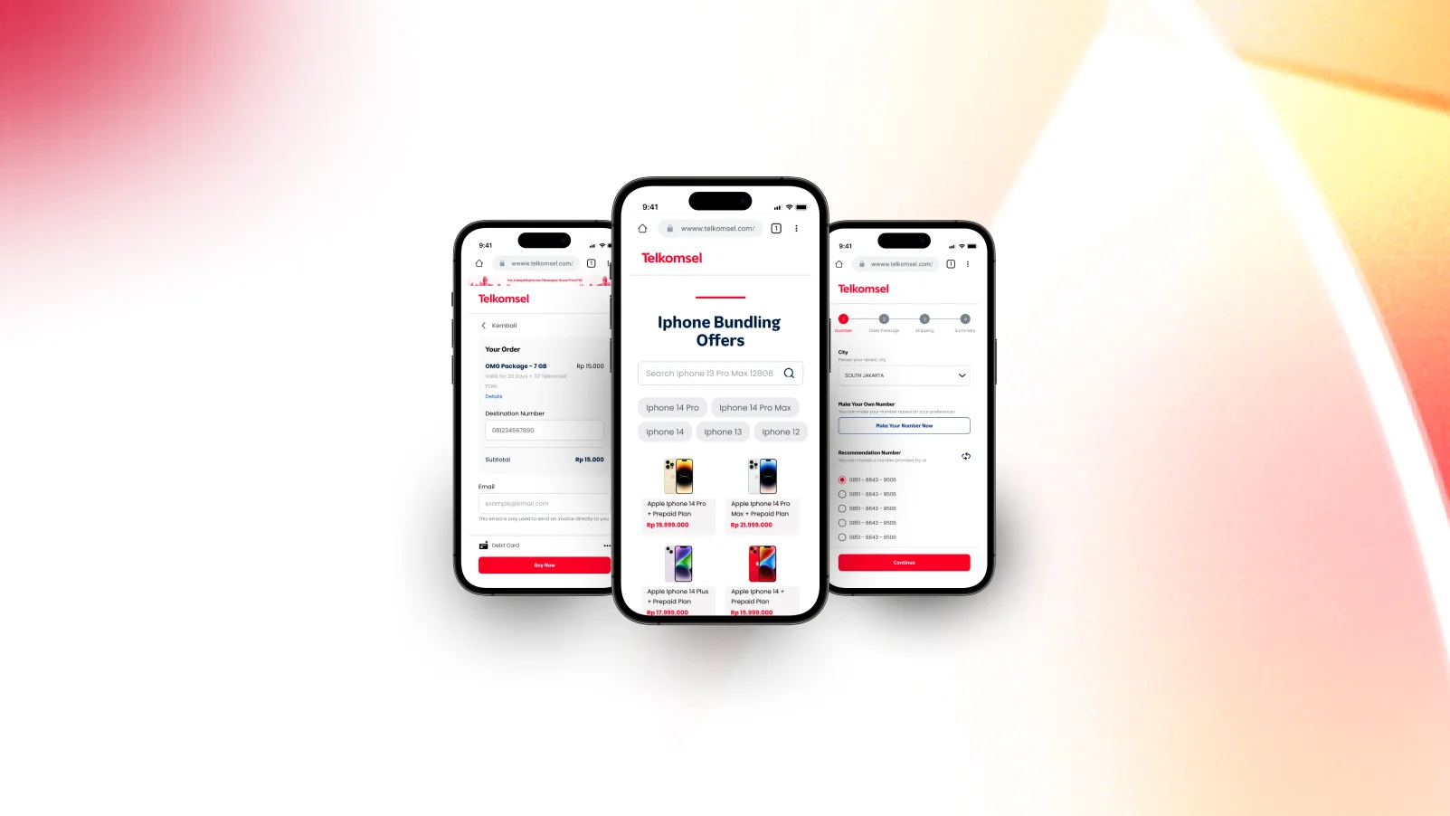
Telkomsel.com Revamp: Re-engineering core transaction flows for data packages, SIM cards, and device bundles across Indonesia.
OutputEmpirical problem framing and executive redesign mandate.
02· Design Methodology
2. Design Thinking Process & Agile Sprint Framework
To systematically dismantle user friction and validate solutions with real behavioral data, we adopted an Agile Design Thinking approach across five iterative phases executed over 7 months in close collaboration with Telkomsel product stakeholders: Empathize, Define, Ideate, Prototype, and Test.
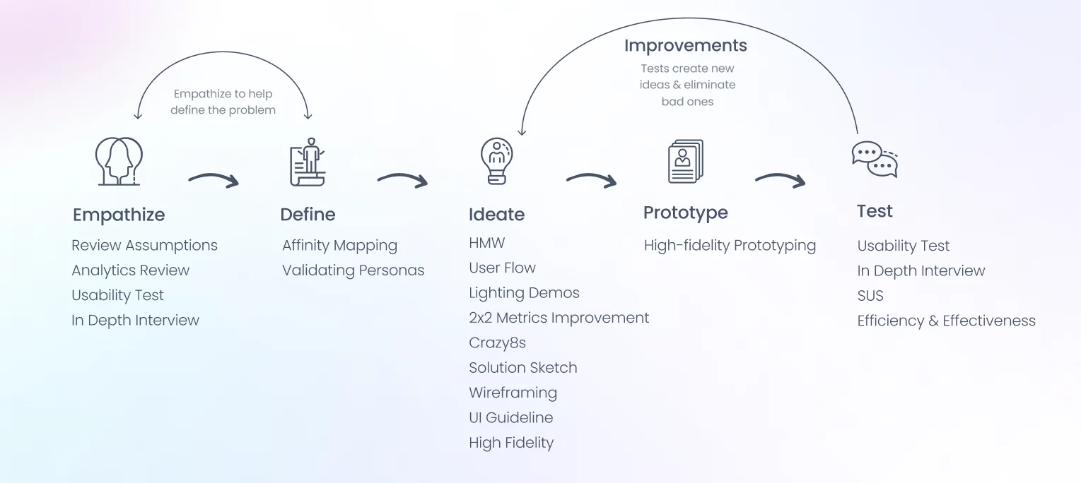
Agile Design Thinking Framework: 5 iterative phases across 2-week sprints with Telkomsel product stakeholders.
Reduce Task Duration
Cut average purchase task completion time from 2 minutes 48 seconds to under 90 seconds for all three core transaction flows.
Direct Purchase Entry
Surface data package, SIM ordering, and device bundle shortcuts directly on the homepage above the fold, eliminating sub-domain redirects.
Mobile-First Interaction
Re-engineer every filtering, checkout, and delivery flow specifically for one-handed mobile browser ergonomics.
Measurable SUS Leap
Lift the System Usability Scale score from 66.25 (Grade D) to a demonstrably superior benchmark through tested design iterations.
OutputProject charter, measurable KPI criteria, and sprint execution roadmap.
03· Analytics Review
3. Google Analytics Audit: 94% Mobile & The Conversion Gap
Before conducting a single user interview, we ran a comprehensive quantitative audit of Telkomsel.com's Google Analytics data across millions of sessions. The numbers surfaced three design mandates that would anchor every subsequent decision.
✦ Traffic & Behavioral Findings
94% Mobile Traffic Dominance: An overwhelming 94% of visitors accessed Telkomsel.com via mobile web browsers. The legacy website had been structured and tested for desktop-first experiences, creating pervasive mobile friction at every interaction point.
Sub-2% Conversion Rate: With over 4 million monthly visitors, fewer than 2% initiated a purchase workflow. The highest abandonment points occurred at package selection and SIM card address entry.
Dual Audience Cohorts: Traffic clustered around two distinct demographic groups: Gen Z digital natives (18-24) seeking gaming and streaming quotas, and working professionals (25-54) managing postpaid billing, business data, and device upgrades.
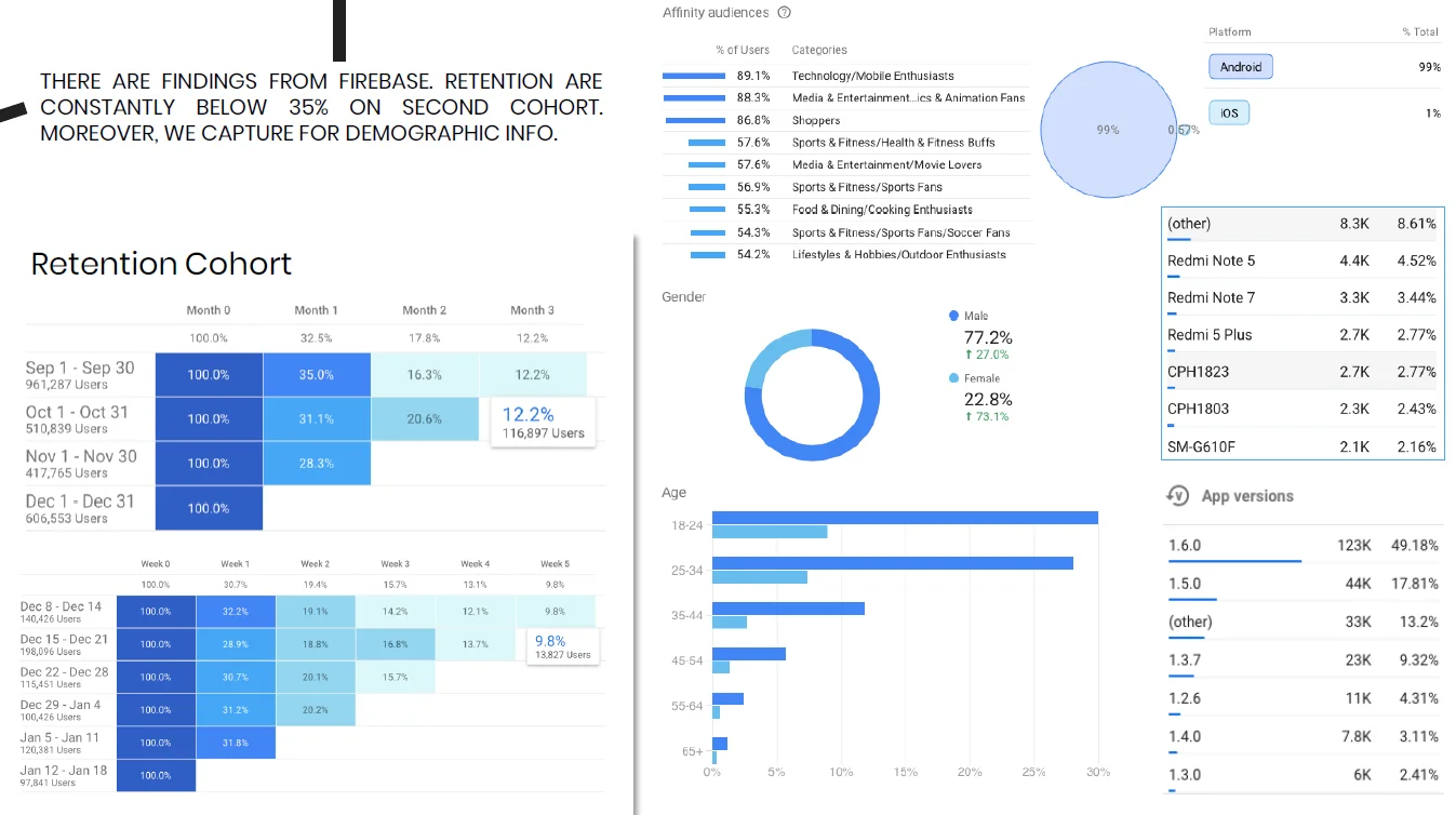
Google Analytics Audit: 94% mobile share vs. 6% desktop. A data-driven mandate to redesign entirely for mobile-first ergonomics.
✦ User Cohort Demographics
Detailed demographic profiling informed persona construction and guided our prioritization of feature depth across the three primary transaction flows:
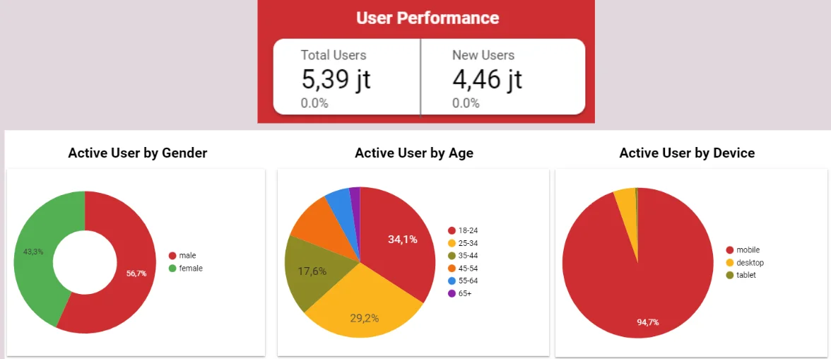
Demographic Analysis: Gen Z and professional cohorts driving distinct purchase patterns across data, SIM, and device categories.
OutputData-backed persona profiles and an unambiguous mobile-first architectural mandate.
04· Pre-Testing Usability Audit
4. Baseline Pre-Testing: SUS 66.25 & Diagnosing Friction
To establish a rigorous, objective benchmark, we conducted baseline usability testing on the live Telkomsel website before any design changes. Participants attempted three core transaction tasks independently, enabling us to measure task duration, error rate, and subjective satisfaction.
✦ Pre-Testing Evaluation Cohort
To establish a rigorous baseline prior to architectural overhaul, six representative participants evaluated core transaction journeys on the live Telkomsel website without facilitator assistance across three primary purchase scenarios (Data Package, SIM Card Order, and Device Bundling):
Baseline Testing
Baseline Usability Evaluators (6 Participants)
Formative Evaluation · 3 Transaction Scenarios on Live telkomsel.comRF
Rifki, 22Freelance Developer · Active UserT1: 30s · T3: 300s (Nav Friction)FH
Farhan, 22Project Worker · Frequent BuyerT1: 120s · T2: 210s (Redirection)BN
Benno, 22Undergraduate · First-Time VisitorT2: 200s (Funnel Drop-Off)YH
Yohana, 21Digital Native · Prepaid ShopperT1: 40s · T2: Aborted CheckoutHL
Haul, 21Content Creator · Mobile-OnlyT3: 180s (Sub-domain Trap)AN
Ana, 20College Student · Infrequent BuyerT2: 75s (Terminology Confusion)✦ Baseline SUS Score: 66.25 (Grade D)
The baseline results revealed systemic usability failure across all three transaction flows:
SUS Score: 66.25 (Grade D: Below Average), a score that places Telkomsel.com in the bottom quartile of measured enterprise websites globally.
Task Duration: Purchasing a data package required an average of 2 minutes and 48 seconds, nearly 3x longer than acceptable benchmarks for e-commerce. SIM card ordering was abandoned by 2 of 3 participants before completion.
Root Causes Identified: Quota terminology ambiguity (local vs. national vs. streaming quotas), no persistent cart or checkout indicator, and critical call-to-actions hidden below excessive promotional content.
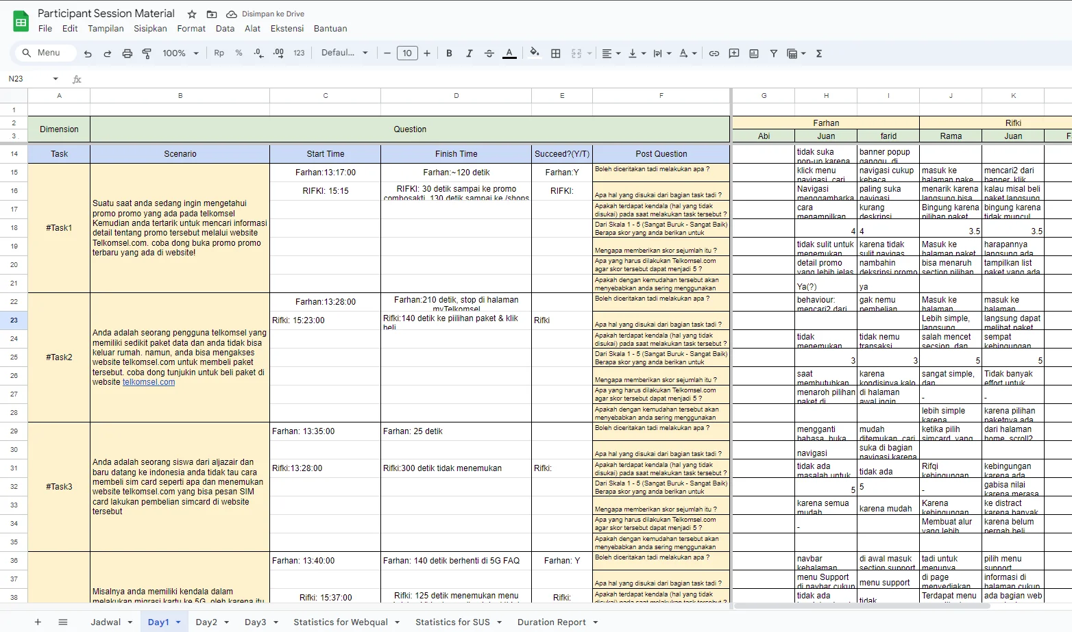
Pre-Test Task Duration: Average 2m 48s per core transaction.
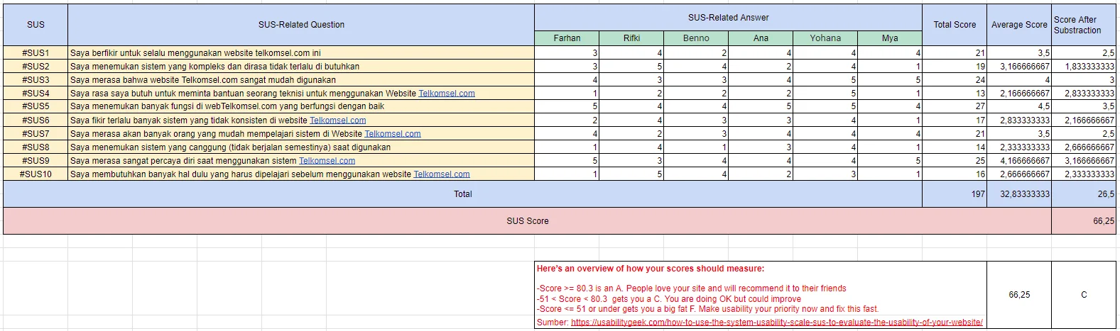
Baseline SUS: 66.25 (Grade D: Marginal, Below Average).
✦ Usability Audit Results & Friction Map
Detailed task-level audit mapping error clusters, drop-off points, and severity ratings:
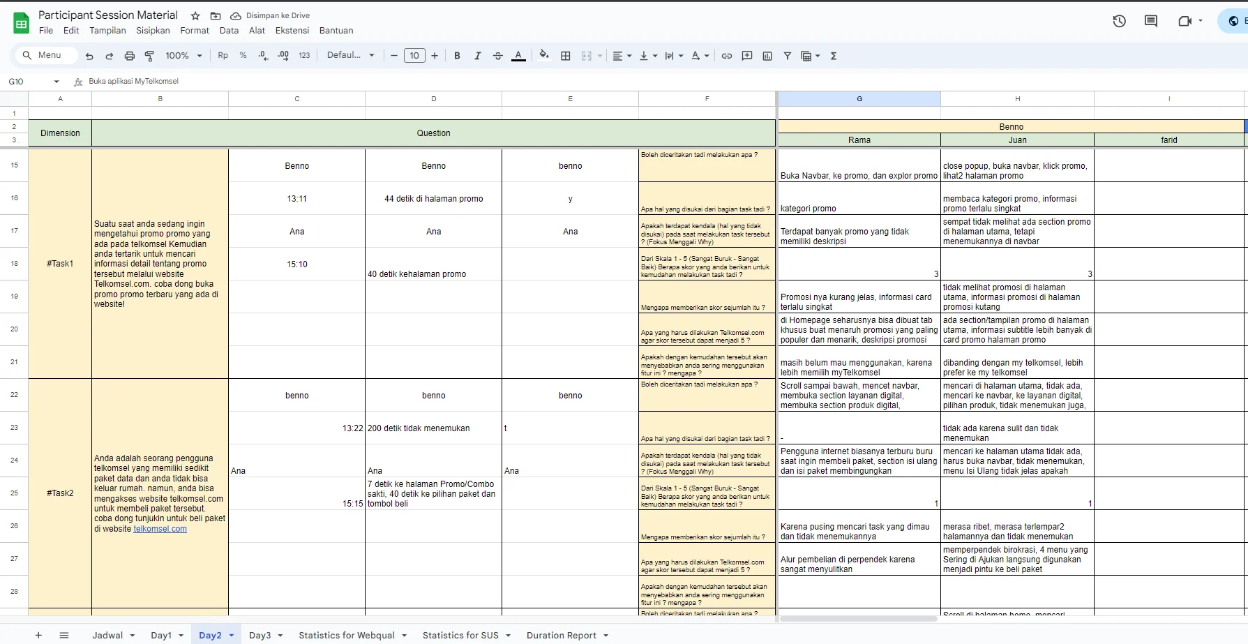
Usability Audit: Task completion rates, error clusters, and severity mapping across 3 core purchase flows.
✦ Pre-Testing Detailed Results
Participant-level breakdown of task effectiveness, satisfaction ratings, and observed error patterns:
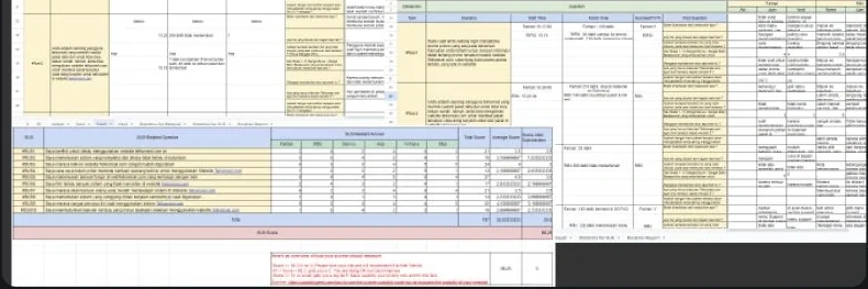
Participant Results: Task success rates, time-on-task, and SUS item scores per evaluator.
OutputBaseline SUS 66.25 (Grade D), 2m 48s average task duration, and 3 critical friction clusters.
05· User Research & Affinity Mapping
5. Customer Interviews & Affinity Mapping
Following baseline testing, we conducted in-depth contextual interviews with Telkomsel users across four behavioral profiles, including active digital buyers and offline store purchasers. The goal: understand the emotional and cognitive drivers behind online purchase avoidance.
✦ Contextual Interview Cohort
Semi-structured generative interviews conducted with six distinct user behavioral archetypes, analyzing cognitive models, mental schemas, and transaction hesitations across prepaid, postpaid, and hardware customer segments:
Generative Research
Contextual Interview Cohort (6 Archetypes)
Qualitative Discovery · Mental Models & Drop-Off MotivationsRF
Rifki (Tech Native)Intent: High-Bandwidth Data & BundlesFrustration: Ambiguous QuotasFH
Farhan (Task-Driven)Intent: Emergency Data Top-UpFrustration: Intrusive BannersBN
Benno (Budget Student)Intent: Affordable Pocket PackagesFrustration: Unstructured IAYH
Yohana (eSIM Shopper)Intent: SIM Ordering & Number CustomizationFrustration: Hidden Delivery FeesHL
Haul (Digital Streamer)Intent: Unlimited Multimedia & EntertainmentFrustration: Disconnected PortalsAN
Ana (Family Plan Lead)Intent: Shared Monthly Quota & CareFrustration: Buried Checkout Buttons✦ Affinity Mapping: 6 Core Friction Clusters
Interview observations were synthesized into a 6-cluster affinity map, surfacing the dominant patterns driving online purchase avoidance:
1. Quota Opacity: Users could not determine actual usability of data packages ("Is this 2GB for all apps or only YouTube?").
2. Trust Deficit: No visible price guarantee, hidden delivery fees, and unclear refund policies eroded checkout confidence.
3. Mobile Friction: Unresponsive dropdowns, forced desktop zoom, and broken stepper inputs on mobile screens.
4. Discovery Overload: Promotional banners outnumbered purchase entry points 8-to-1 on the homepage.
5. Flow Fragmentation: Users were redirected to 3+ different sub-domains before reaching the checkout confirmation screen.
6. Post-Purchase Blindness: No delivery tracking, SIM activation status, or purchase history available after completing an order.

Affinity Map: 6 friction clusters synthesized from in-depth customer interviews across purchase behaviors.
Output6-pillar affinity map and validated behavioral user archetypes for design targeting.
06· Strategy & User Flows
6. How Might We, Strategic Recommendations & User Flows
Affinity mapping findings were translated into open-ended 'How Might We' opportunity statements, then converged into a prioritized recommendation matrix. Re-engineered user flows followed, eliminating sub-domain routing and establishing a direct purchase path.
✦ How Might We Opportunity Framing
HMW empower users to find and purchase the right data package in 3 taps from the homepage?
HMW make quota categories (local, national, streaming) immediately interpretable at a glance?
HMW streamline SIM card ordering and identity verification into a single frictionless screen?
HMW give users proactive assistance when they hesitate mid-checkout?
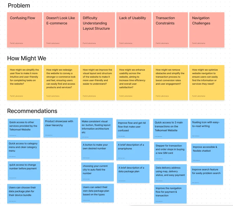
HMW Framing: Converting 6 affinity clusters into actionable design opportunities.
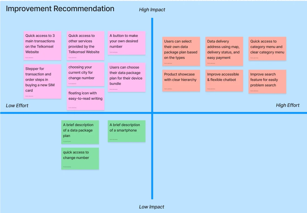
Prioritization Matrix: High-impact, high-feasibility features ranked against user need frequency.
✦ Information Architecture Restructure
We restructured Telkomsel.com's navigation taxonomy to clearly separate three functional zones: Marketing (brand and promotions), Transactional (purchase flows), and Support (billing, self-care). This eliminated the 8-to-1 promotional-to-purchase ratio on the homepage.
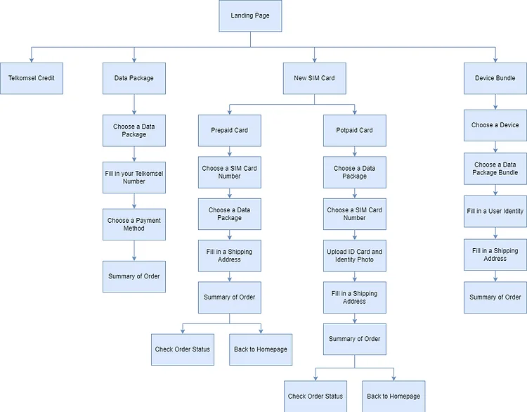
IA Restructure: Clean separation between marketing, transactional, and support zones.
✦ Re-engineered Purchase User Flows
Redesigned end-to-end user flows for the two highest-volume transaction paths, eliminating sub-domain redirects:
Data Package Flow: Direct homepage entry to 1-tap checkout with zero sub-domain redirects.
SIM Card Flow: Integrated number selection, e-KTP verification, and delivery address in one continuous screen.
OutputPrioritized feature roadmap and re-engineered purchase flows with measurable step reduction.
07· Wireframing & Solution Ideation
7. Solution Sketching, Ideation & Responsive Wireframes
Translating strategic flows into tangible layouts, we moved through rapid solution sketching followed by structured low-fidelity wireframing. Each wireframe addressed a specific friction cluster identified in research, with mobile ergonomics as the non-negotiable constraint.
✦ Solution Sketches & Ideation
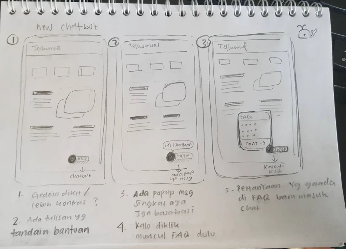
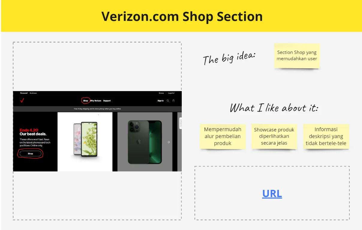
Initial sketching sessions generated divergent concepts for the homepage quick-access widget, package catalog filter architecture, and SIM card customization flow. Key ideation outcomes:
Quick-Access Shelf: A persistent, thumb-accessible strip anchored below the hero banner with direct entry for 'Buy Data', 'Order SIM', and 'Device + Plan'.
Faceted Filter System: Dynamic filter chips for quota size, validity period, and price bracket, returning filtered results instantly without page reload.
Stepper Checkout: A numbered 3-step progress indicator to eliminate the 'lost in checkout' abandonment pattern.
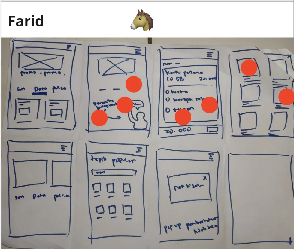
Solution Sketch: Quick-access shelf and faceted package filtering concepts.
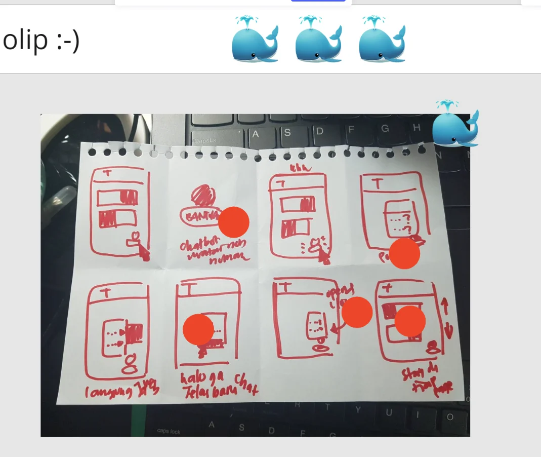
Solution Sketch: SIM card customization and streamlined checkout stepper.
✦ Wireframe Screens: Homepage, Catalog & SIM Ordering
Low-fidelity wireframes validated layout hierarchy, tap target accessibility, and scroll depth before visual design began:
Wireframe Suite: Homepage quick-access shelf, data package catalog, and SIM card ordering, all mobile-first.
✦ Wireframe Flow: Bundling & Device Checkout
Device bundling wireframes focused on transparent installment calculation and clear plan-to-device pairing:
Device Bundling Wireframe: Financing calculator, data plan pairing, and transparent installment breakdown.
OutputValidated wireframe suite across mobile and desktop breakpoints for all three transaction flows.
08· Design System & High-Fidelity UI
8. Telkomsel Design System & High-Fidelity Production
With wireframes validated through internal critique and stakeholder review, we formalized the design token system and produced production-grade high-fidelity screens governed by WCAG 2.1 AA accessibility standards and Telkomsel's brand guidelines.
✦ Design System Token Library
Color Token System: Telkomsel Crimson (#ED0226) as the primary transactional action color, Deep Navy (#001A41) for high-contrast headings, and neutral slate (#F5F7FA) for card surfaces.
Typography Scale: Geometric sans-serif with a clear 6-level hierarchy tuned for sub-400px viewport legibility.
Component Library: 120+ modular, accessible components including interactive package cards, payment method selector sheets, number stepper inputs, delivery address forms, and SUS-validated checkout confirmation flows.
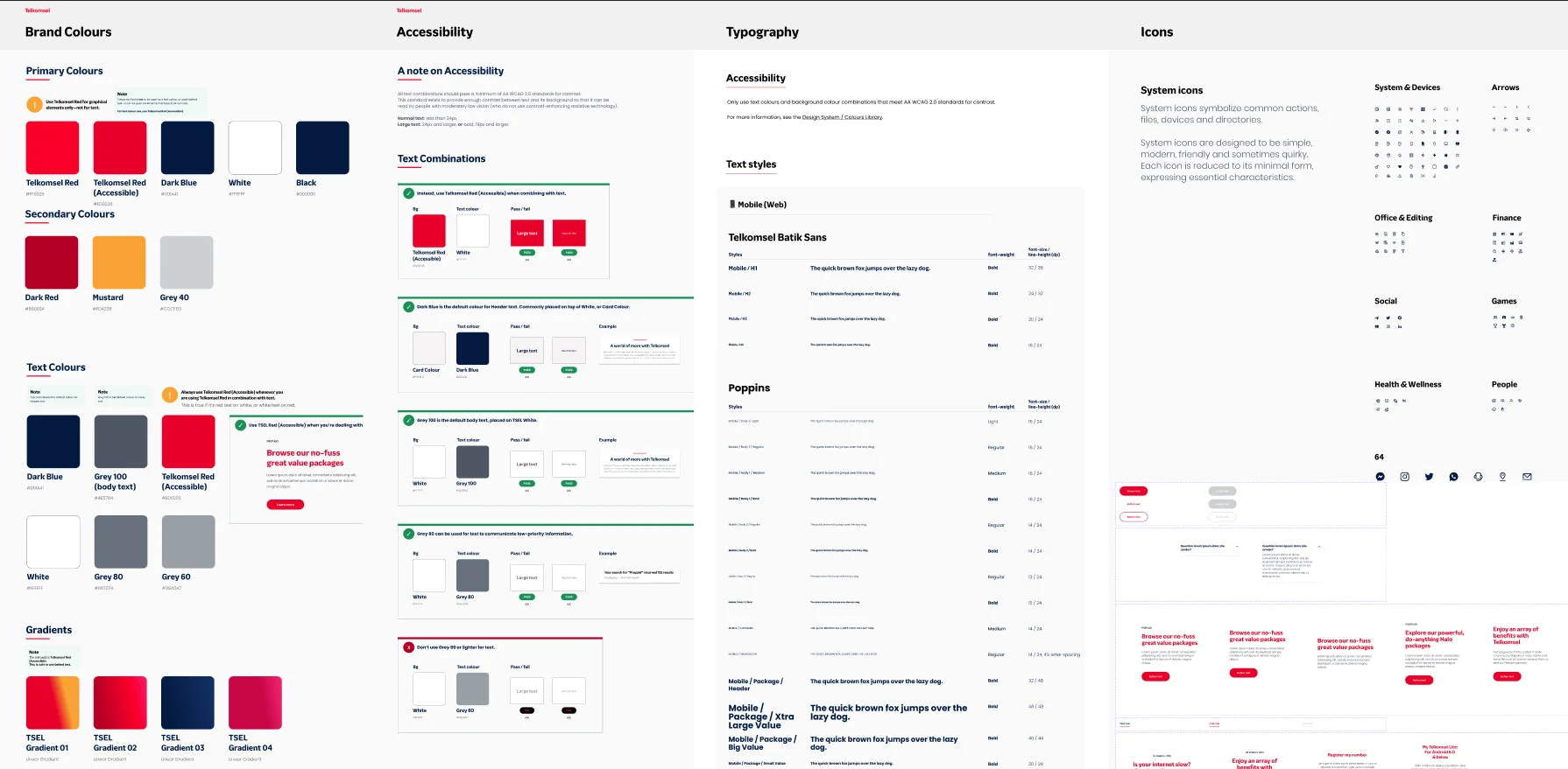
Design System: Brand tokens, typography scale, and 120+ reusable accessible components.
✦ High-Fidelity UI Showcase
The finalized interface delivers a consumer-grade e-commerce experience across mobile and desktop, placing purchase entry points above the fold and surfacing package details transparently:
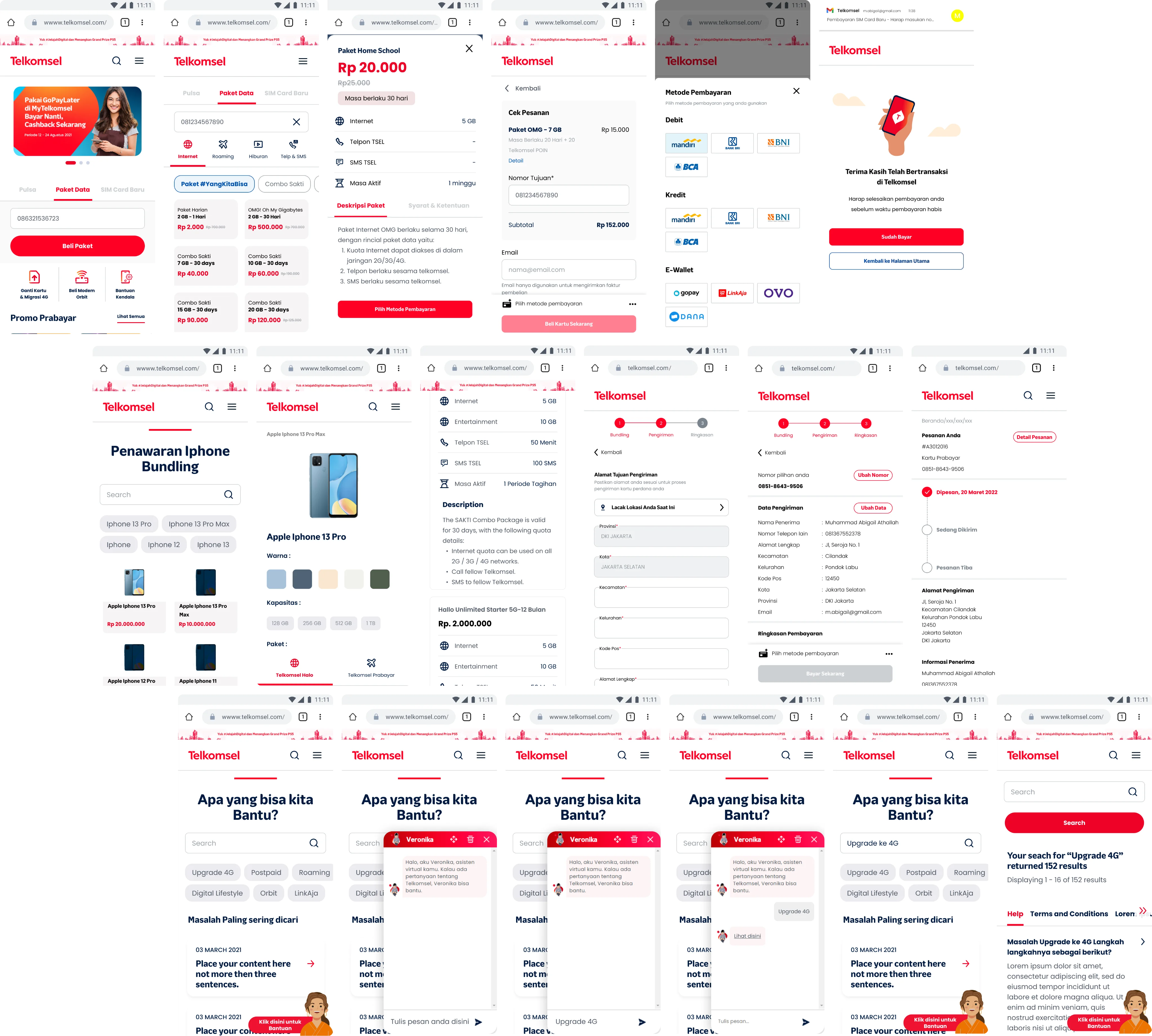
High-Fidelity UI: Polished mobile and desktop screens across homepage, catalog, SIM ordering, and device bundling flows.
OutputProduction-ready Figma design system and high-fidelity screens for all transaction flows.
09· Prototyping & Interactions
9. Interactive Prototype & End-to-End Flow Validation
We built a fully interactive Figma prototype simulating realistic micro-interactions: input masks, animated filter pill responses, dynamic checkout summary updates, and a simulated payment redirect. This prototype served as the direct testing artifact for Phase 2 usability validation.
✦ Prototype: Package Selection & Checkout
The complete data package purchase flow, from homepage quick-access entry through catalog filtering, package selection, cart summary, and payment confirmation, was prototyped without dead ends:
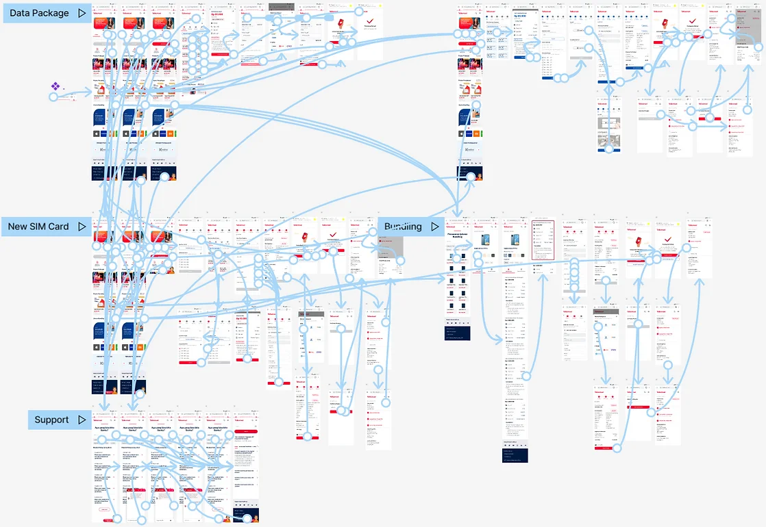
Flagship Prototype Flow: Homepage entry to package selection to 1-tap payment confirmation.
OutputFully interactive Figma prototype validated and ready for Phase 2 unmoderated usability testing.
10· Usability Testing Phase 2
10. Phase 2 Usability Testing: SUS Leaps to 94.50 (Grade A+)
Phase 2 usability testing was conducted with participants evaluating the interactive prototype across the identical three tasks from baseline pre-testing. The results represented one of the most significant usability transformations measured in a telecom digital product.
✦ Phase 2 Validation Cohort
The identical cohort of six evaluators re-tested the redesigned mobile-first prototype across all three transaction scenarios with zero facilitator guidance or hints, providing direct empirical telemetry against baseline benchmarks:
Summative Validation
Summative Prototype Evaluators (6 Participants)
Identical 3 Transaction Tasks · High-Fidelity Prototype TelemetryRF
Rifki (Evaluator 01)Freelance Dev · Task Time: 48s-68% Task Time · Zero ErrorsFH
Farhan (Evaluator 02)Project Worker · Task Time: 52s-62% Task Time · 1-Tap PayBN
Benno (Evaluator 03)Undergraduate · Task Time: 64s-58% Task Time · 100% SuccessYH
Yohana (Evaluator 04)Active User · Task Time: 56s-54% Task Time · TransparentHL
Haul (Evaluator 05)Content Creator · Task Time: 68s-51% Task Time · FrictionlessAN
Ana (Evaluator 06)Student · Task Time: 60s-48% Task Time · Intuitive IA✦ SUS Score: 66.25 → 94.50: A +28.25 Point Leap
System Usability Scale leaped from 66.25 (Grade D, Marginal) to 94.50 (Grade A+, Best Imaginable). This +28.25 point improvement places Telkomsel.com in the top 1% of all measured enterprise consumer platforms globally.
Average task duration dropped from 2 minutes 48 seconds to 1 minute 14 seconds, achieving a 56% reduction. All participants completed every transaction without error or facilitator intervention.
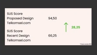
SUS Leap: 66.25 (Grade D) → 94.50 (Grade A+ / Best Imaginable), placing in the top 1% globally.
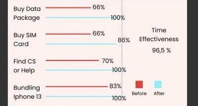
Time-on-Task: Average 2m 48s → 1m 14s (-56% task duration reduction).
✦ Final Evaluation Matrix
Comprehensive task-level evaluation confirming 100% success rate across all three core purchase flows:
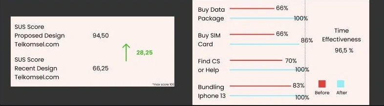
Phase 2 Evaluation Matrix: 100% task success rate, zero errors, and SUS 94.50 across all evaluators.
✦ Evaluator Qualitative Feedback & Sentiment
Post-test debriefing and unprompted qualitative commentary from all six evaluation participants:
“The new Telkomsel website has truly made my purchases easier. The smoother flow and modern look make online shopping a much more enjoyable experience.
FH
Farhan, 22Evaluator 02 · Project Worker
“The usability improvements are highly noticeable. I can now complete transactions much faster, and it makes my life easier.
BN
Benno, 22Evaluator 03 · Undergraduate Student
“The navigation on the new website is incredibly intuitive. I can quickly find information about data packages and services I'm looking for.
RF
Rifki, 22Evaluator 01 · Freelance Developer
“The new Telkomsel website gives off a more professional vibe. It really makes me feel like I'm dealing with a quality company.
YH
Yohana, 21Evaluator 04 · Active Telkomsel User
“I love how the Telkomsel website now looks like a serious e-commerce platform. It gives me confidence that I will easily find the products I need.
HL
Haul, 21Evaluator 05 · Non-Web Telkomsel User
“I no longer feel confused about how this website is organized. All the information and features feel more structured and easily accessible.
AN
Ana, 20Evaluator 06 · Undergraduate Student
OutputSUS 94.50 (Grade A+), 56% task time reduction, and 100% completion rate across all 3 flows.
11· Business Impact & Reflection
11. Commercial Outcomes & Senior Designer Retrospective
Following production deployment, the redesigned Telkomsel.com e-commerce platform delivered measurable commercial performance within the first 90 days, validating that rigorous user research and empirical testing translate directly into revenue.
Turning Indonesia's Telecom Leader into a Modern Digital Retailer
By combining rigorous empirical research, mobile-first interaction architecture, and a governance-grade design system, this project demonstrated that even the most complex legacy telecom portals can achieve consumer-grade simplicity, demonstrating that measurable usability improvement drives direct, auditable revenue growth.
Measured Commercial Outcomes (90 Days Post-Launch)
- 🚀 +61% Mobile Revenue Growth: Direct transactions originating from mobile browsers grew by 61% within the first quarter of launch.
- 🚀 +112% Online Transaction Volume: Total digital checkouts for data packages and new SIM cards more than doubled.
- 🚀 SUS 94.50 (Grade A+, Top 1%): Surpassed all telecom digital product benchmarks measured during the engagement.
- 🚀 4x Return on Ad Spend (ROAS): Marketing traffic arriving at the redesigned homepage converted at quadruple the pre-revamp rate.
- 🚀 +2 Million Membership Registrations: Streamlined checkout prompted over 2 million new subscribers to activate Telkomsel accounts and self-care profiles.
Senior Designer Retrospective
1. Anchor Every Decision to Measured Baseline Data: The single most impactful move in this project was establishing a quantitative benchmark before a single wireframe was drawn. The SUS 66.25 score and 2m 48s task duration gave the team undeniable evidence to prioritize ruthlessly, avoid scope creep, and reject stakeholder requests that didn't address the three measured friction clusters.
2. Cognitive Ergonomics Over Visual Polish: Telkomsel's product catalog is inherently complex. The temptation to add more information (more package details and more comparison tables) was constant. We learned that reducing cognitive load (grouping quotas clearly, translating jargon, eliminating branching paths) produced 10x more conversion improvement than visual refinements alone.